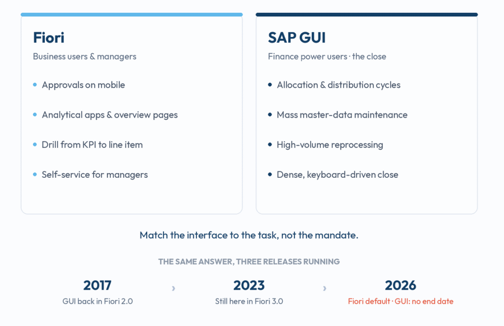
Back in 2017 I wrote a post called “The SAP GUI menu is back in Fiori 2.0.” In 2023 I wrote another one, “Embracing the Past: SAP GUI is still here in Fiori 3.0.” So here we are again, and I might as well keep the streak going.
S/4HANA 2025 shipped last October with Fiori 3.0 and the Horizon theme as the default user interface. Maintenance runs to 2030. Fiori is, on paper, the face of the product now. And yet, walk onto any Finance project in 2026 and watch where the close team actually works. They are in GUI. Still. And SAP, for all the theming, has never published an end-of-maintenance date for SAP GUI. That silence tells you more than any roadmap slide.
So let me do the 2026 version of this post, from the Finance chair this time. And let me say it up front, because it matters: I open every new S/4HANA release genuinely curious to see how far the Fiori finance apps have come, and lately they keep surprising me. This is not a GUI loyalist digging in. It is someone who actually wants both to be good.
The same answer, three releases running
In 2017 the story was that SAP had quietly put the old menu back because people could not find their transactions. In 2023 the story was that GUI was still shipping, still needed, despite years of Fiori-first messaging. In 2025 the theme got a fresh coat of paint, Horizon, and Fiori became the default.
Notice what did not happen in any of those releases. SAP never said “and SAP GUI goes away on this date.” They themed it, they wrapped it, they made Fiori the front door. But they have never dared to switch off the back one. As many of you know, when a vendor avoids committing to a sunset date for eight years running, it is not an oversight. It is because they know what would happen to the power users if they tried.
Where my finance teams actually sit
On the projects I work on, the Finance close team lives in GUI, and they are right to.
Month-end close is dense, repetitive, keyboard-driven work. You are running allocation and distribution cycles, mass-maintaining master data, reprocessing, reconciling, jumping from one transaction to the next with /n and a transaction code faster than you could find the equivalent tile. For that kind of high-volume work, GUI’s information density and keyboard speed still beat clicking through a Fiori app that was designed, quite deliberately, for a business user doing one task at a time on a tablet.
This is not nostalgia. It is the right tool for the job. A controller pushing through a hundred line items at close does not want whitespace and a friendly card layout. They want everything on one screen and their hands on the keyboard. Fiori was never built for that user, and pretending it was is how you slow a close team down in the name of modernisation.
Where Fiori genuinely wins for Finance
Now let me be fair, because the other half of this is just as true, and it is where the original instinct to praise Fiori is correct.
For everything that touches a business user or a manager, Fiori is the better answer, full stop. Approvals are the obvious one. A cost centre manager approving a journal or a parked document from their phone is a real improvement over the old workflow inbox. The analytical apps are the other, and this is where I genuinely light up. I have always liked the embedded analytics in S/4HANA, and the Fiori overview pages that let you start at a KPI and drill straight down to the line item are genuinely good. The first time I drilled from a margin number into the underlying documents without leaving the app, I thought, finally, this is what embedded analytics was always supposed to feel like! Manage Journal Entries, the line-item browsers, the market-segment and overhead analysis apps. For self-service, for analytics, for anyone who is not in the system all day, Fiori wins easily.
That is the point the GUI loyalists miss as badly as the Fiori evangelists miss the close team. Fiori is not a worse GUI. It is a different interface for a different user.
So which one?
Both. It was both in 2017, it was both in 2023, and in 2026 it is still both. The difference is that I have stopped treating that as an awkward transition state to apologise for.
The hybrid is the design. Match the interface to the role and the task. Give your finance power users GUI for the dense, high-volume close work where it still wins, and stop letting a “Fiori-only” slogan slow them down. Give your business users and managers Fiori for approvals, analytics and self-service, and stop letting the power users wave the analytical apps away as toys. The mistake is not choosing one interface. The mistake is forcing one interface on a role it was never built for.
Where do I land on the gaps? Honestly, Fiori has closed a lot of ground since my 2023 post, and that genuinely excites me. A good number of finance tasks I would have insisted on doing in GUI three years ago now have a Fiori app I would actually use. I cannot wait to sit down with a clean 2025 system and re-run my old GUI-only list, because I suspect half of it has quietly been solved. I have not retested every one of them yet, so take that as a direction, not a benchmark. The place I still want SAP to push is the mass-processing, power-user end. Give the close team the density they need inside Fiori and the GUI question finally goes away on its own. Until then, it does not.
So my prediction for the next theme, whatever they call it after Horizon: the answer will still be both. I will probably write this post again.
What about you? Have the Fiori finance apps got far enough that your close team has actually moved off GUI, or are they still living in transactions like mine? Let me know in the comments. Stay tuned.